People First, Always
This isn’t a tagline. It’s my product theology.
Real people use the things we build. They bring their hopes, habits, hangups, and history with them into every tap, swipe, and scroll. If we forget that, if we reduce them to “conversion events” or “churn risks,” we risk building something efficient, but empty. Polished, but pointless.
My background? A little quixotic, sure.
Undergrad in Exercise and Sports Science. Minor in Psychology.MBA with a focus on Marketing and Venture Management.Master of Arts in Biblical Studies.
Yes, I’ve earned an odd collection of degrees, but to me, they’re deeply connected.
What some see as a strange mix, I see as overlapping lenses. And after going deep in three different disciplines, I started to notice that most fields of study share the same underlying ideas; they just use different words, acronyms, and uniforms.
And when you start seeing the connections, you stop trying to solve problems with complexity. You start simplifying. Most industries, strategies, and systems are only complicated because we made them that way. If you’ve ever been frustrated at your bank when trying to move money, know that it’s not difficult to design a fraud-resistant solution. If the process is difficult, it is because it was made difficult. Why? Banks don’t like to lose deposits—they’ve added friction to reduce use of the feature (thankfully, this is changing). Always look for the simple answer before jumping to the complex.
Back hurts? Look at your shoes before you schedule surgery. Business stalling? Look at your people before you revamp your processes. Church flatlining? Look at your impact before your donor logs.
I bring this same lens into marketing. In its simplest form:
What you show is what you sell.
At Sonic: show the chicken, sell the chicken.
In banking: show the APY, sell the APY.
In coffee: you sell lattes, because most people don't love coffee, they love milk and flavoring in their coffee.
If you overcomplicate your menu, you’ll train your customer to overcomplicate their order. Fill the loan confirmation flow with financial jargon, and your support line will fill up with frustrated users.
Just because the user asks for a complicated solution doesn’t mean you should give them a complicated experience. Our instinct is to overcomplicate, overengineer, overcompensate, and overwhelm. But just because the backend has to be smart doesn’t mean the frontend should feel like you're taking a test.
When in doubt, ask: How do they actually use it?
Not what they say in a survey. Not what they shout in a review.
That’s why user complaints are often the worst data you can get.
Customer: “If only you had feature X and toggle Y, I’d use the app more."
Product Lead: “Cool. Let’s take a look at how you’re using A and B first.”
Don’t oversolve too early.
Make A and B useful.
Erika Hall’s Just Enough Research is a book I recommend to every PM and designer I work with. She reminds us what matters most: context. The person using the product is your priority. Everyone and everything else are secondary.
For me, that translates into a simple framework—the 4 Ps of Product:
- Person – Who it’s for. Talk to your 2–3 personas. Often.
- Place – Where they are. The digital, physical, or hybrid context.
- Product – What you offer. A solution to a real want or need.
- Purpose – Why it matters. Emotional resonance, cultural fit, or deeper motivation.
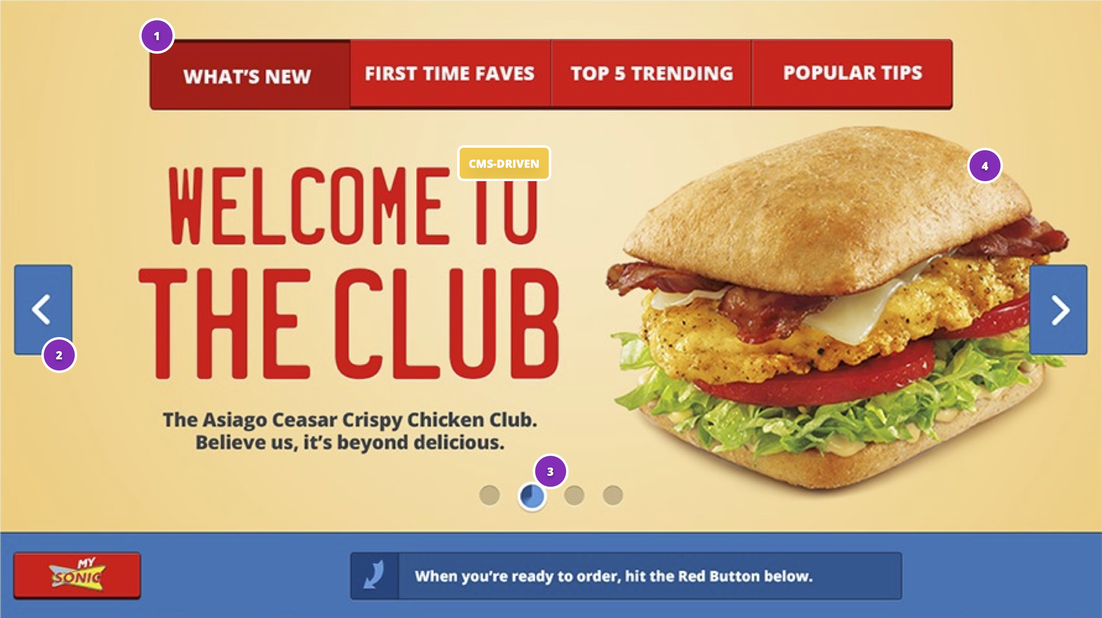
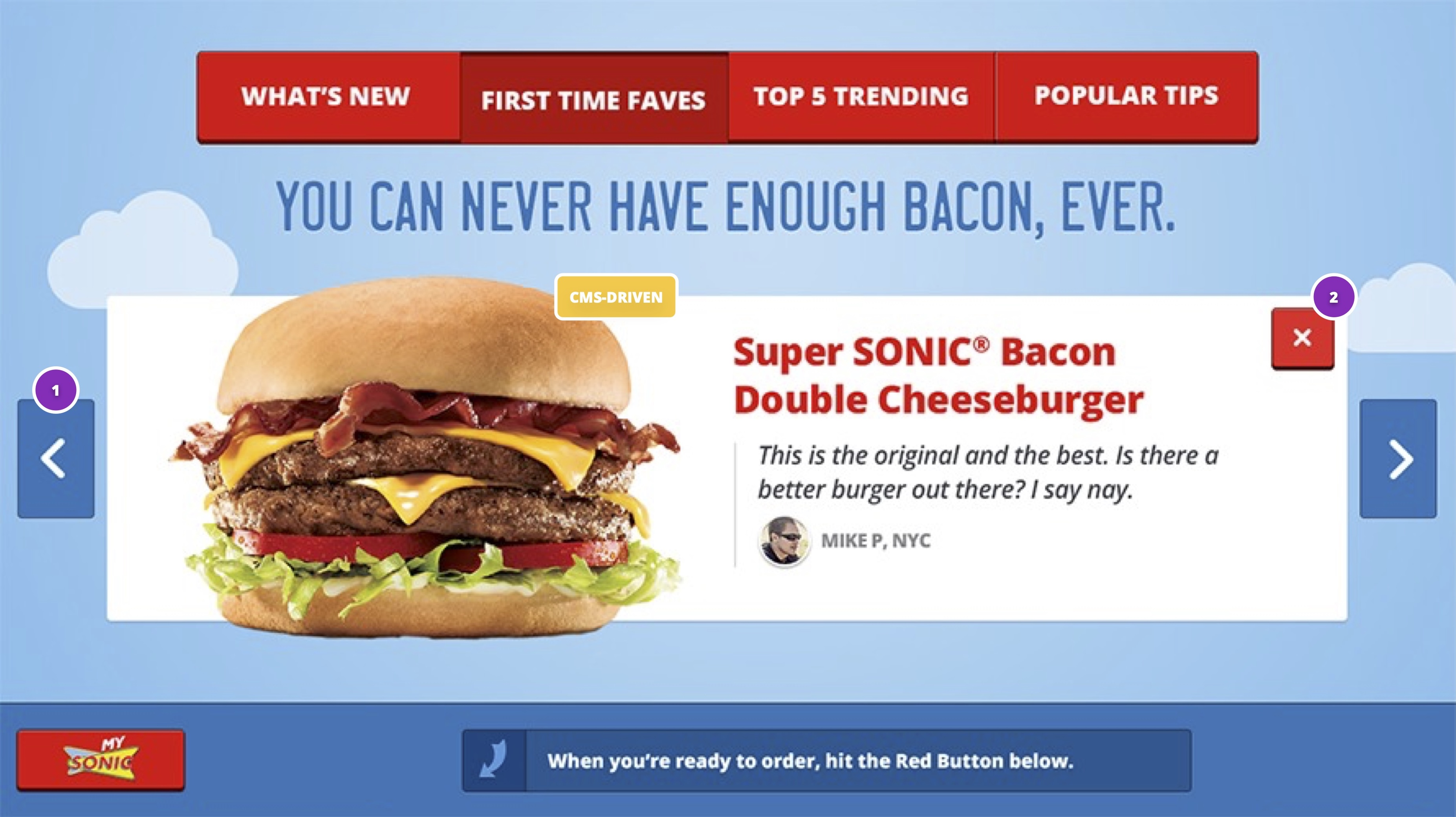
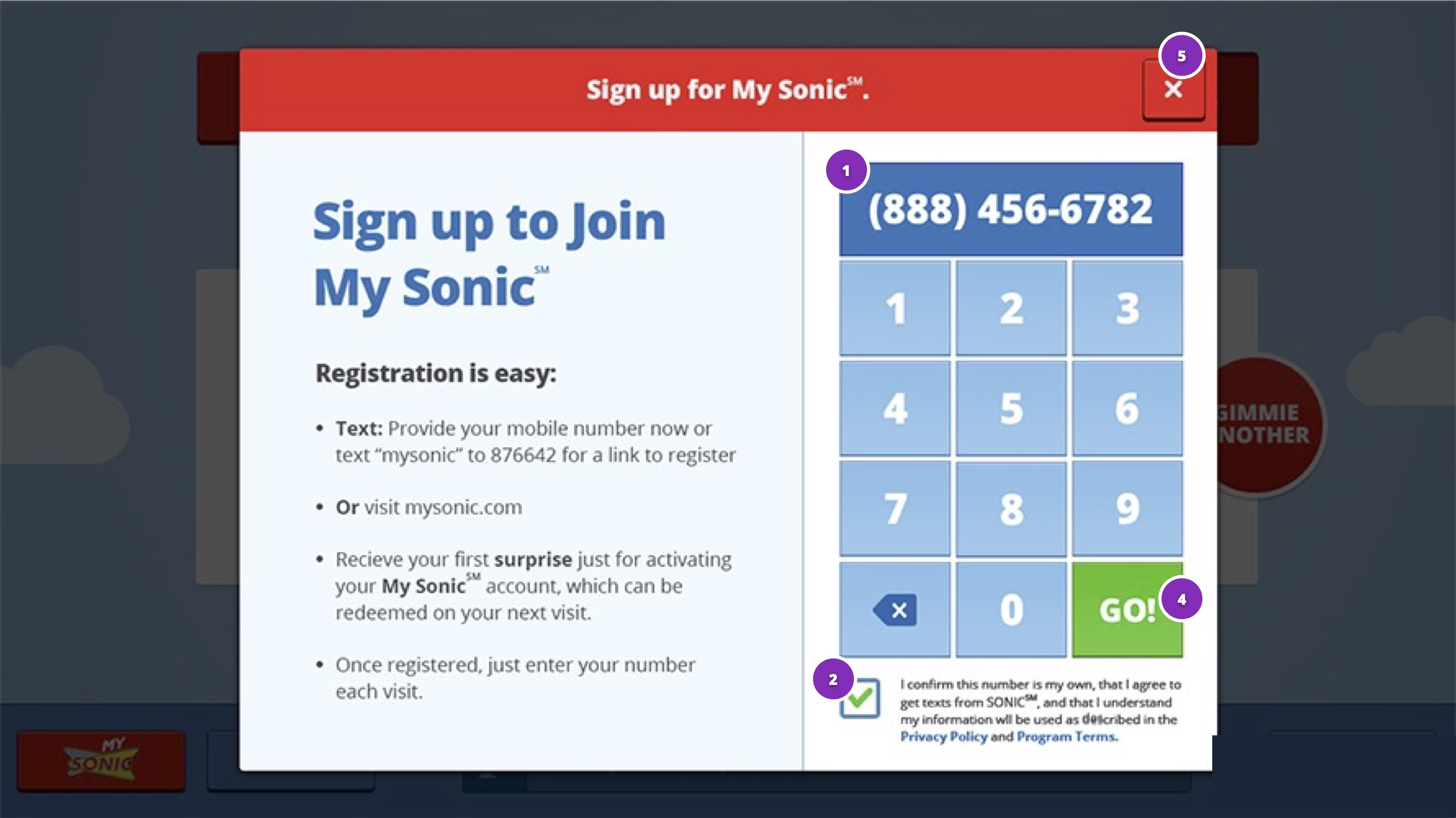
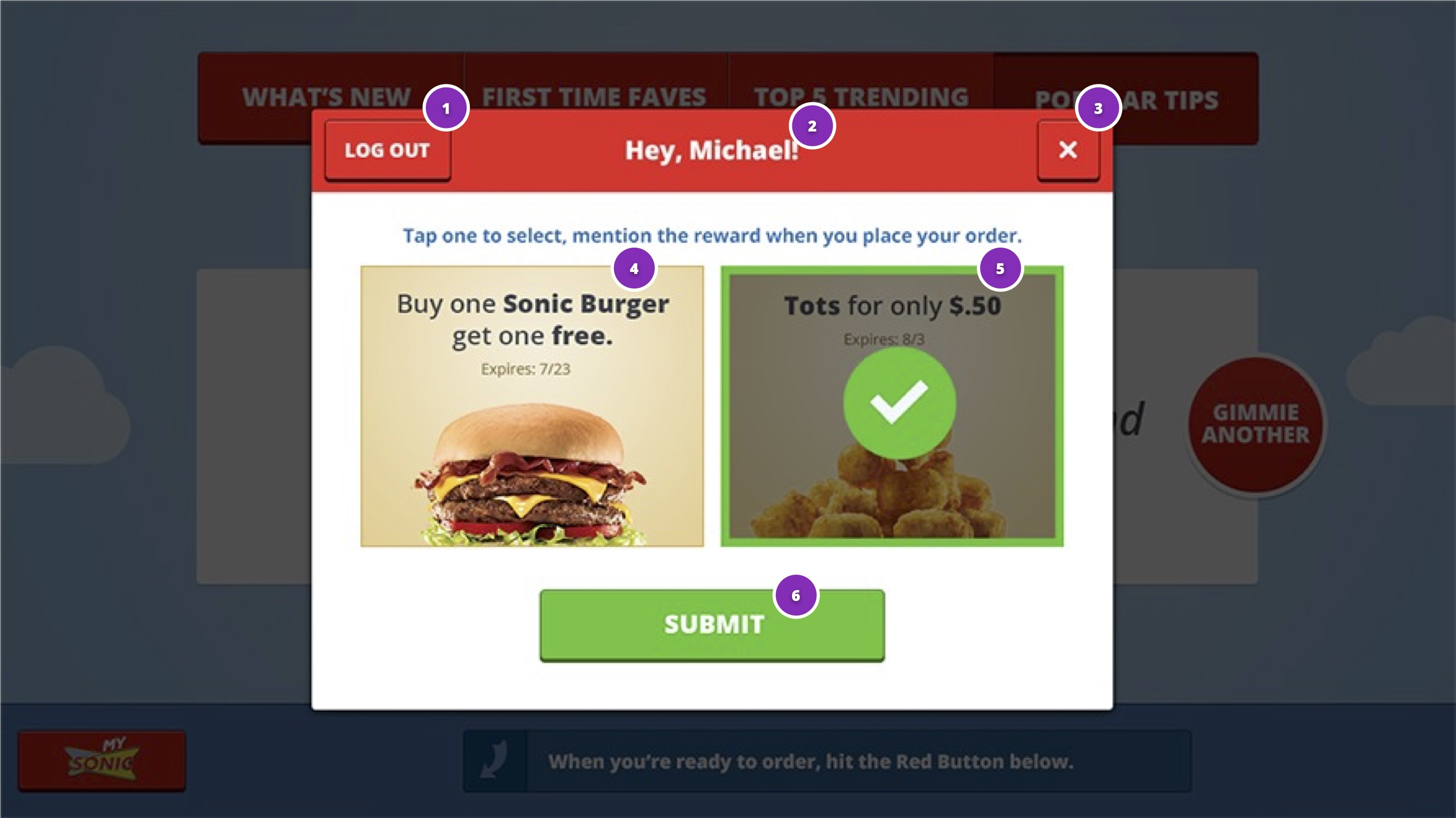
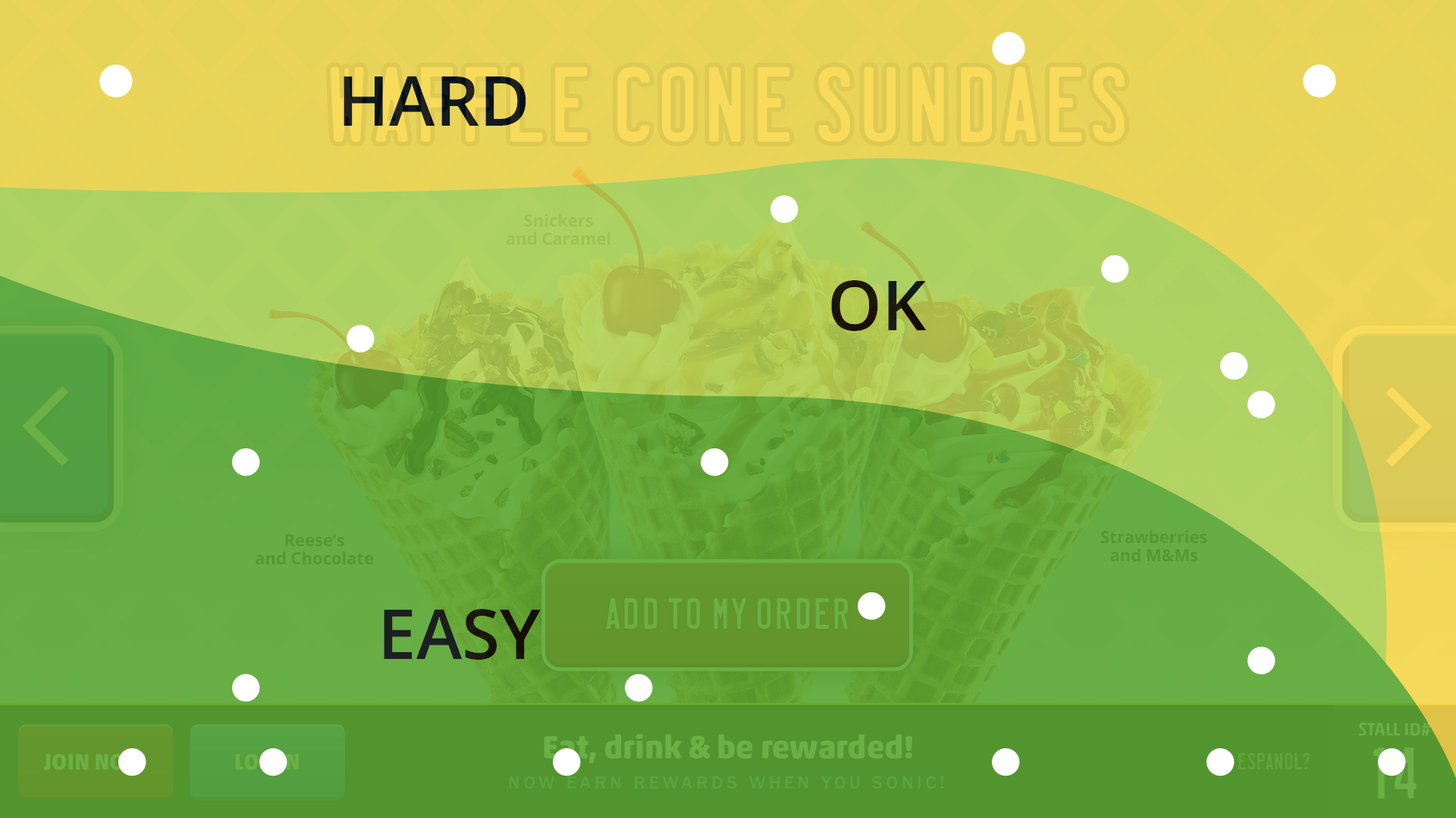
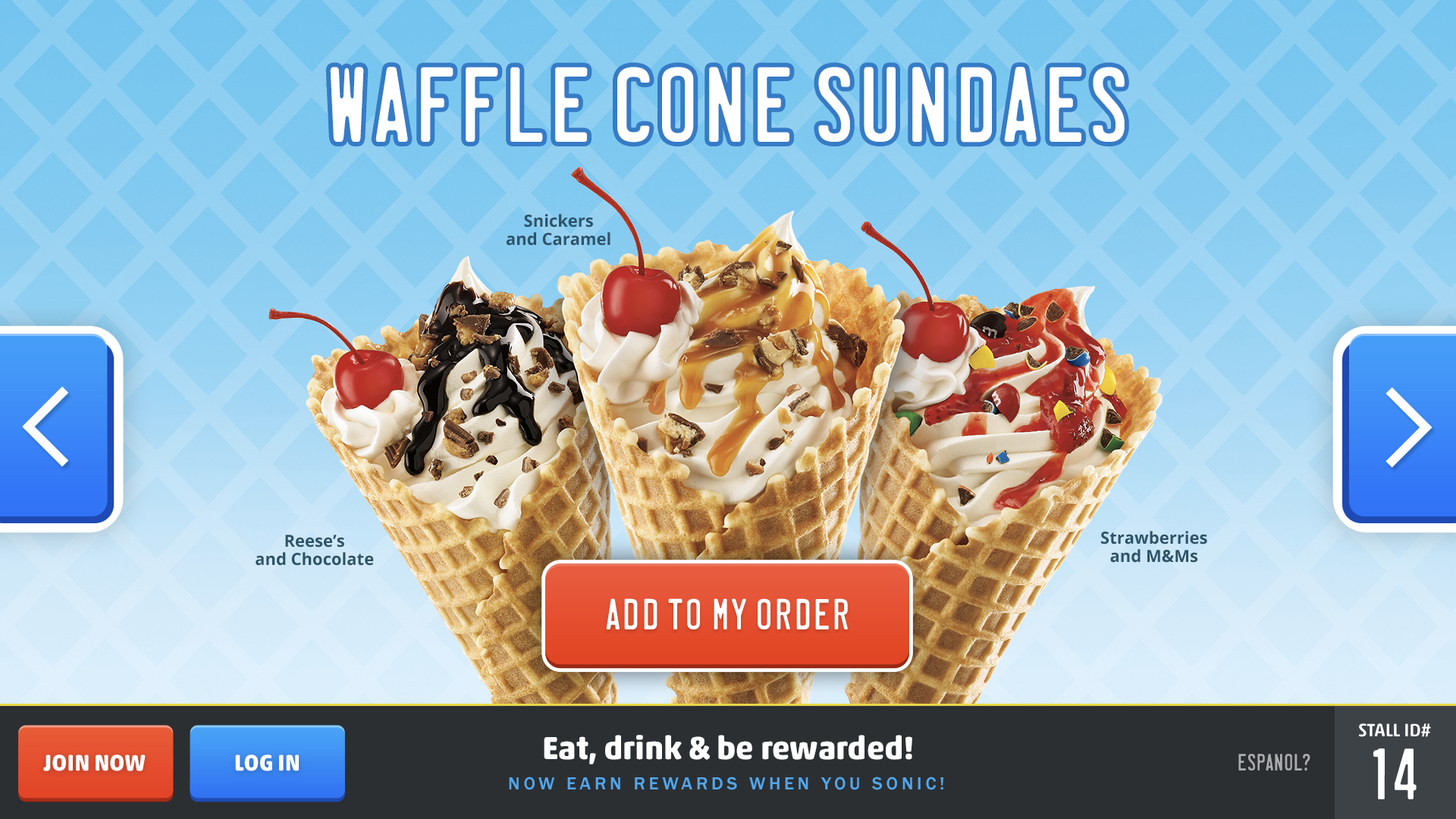
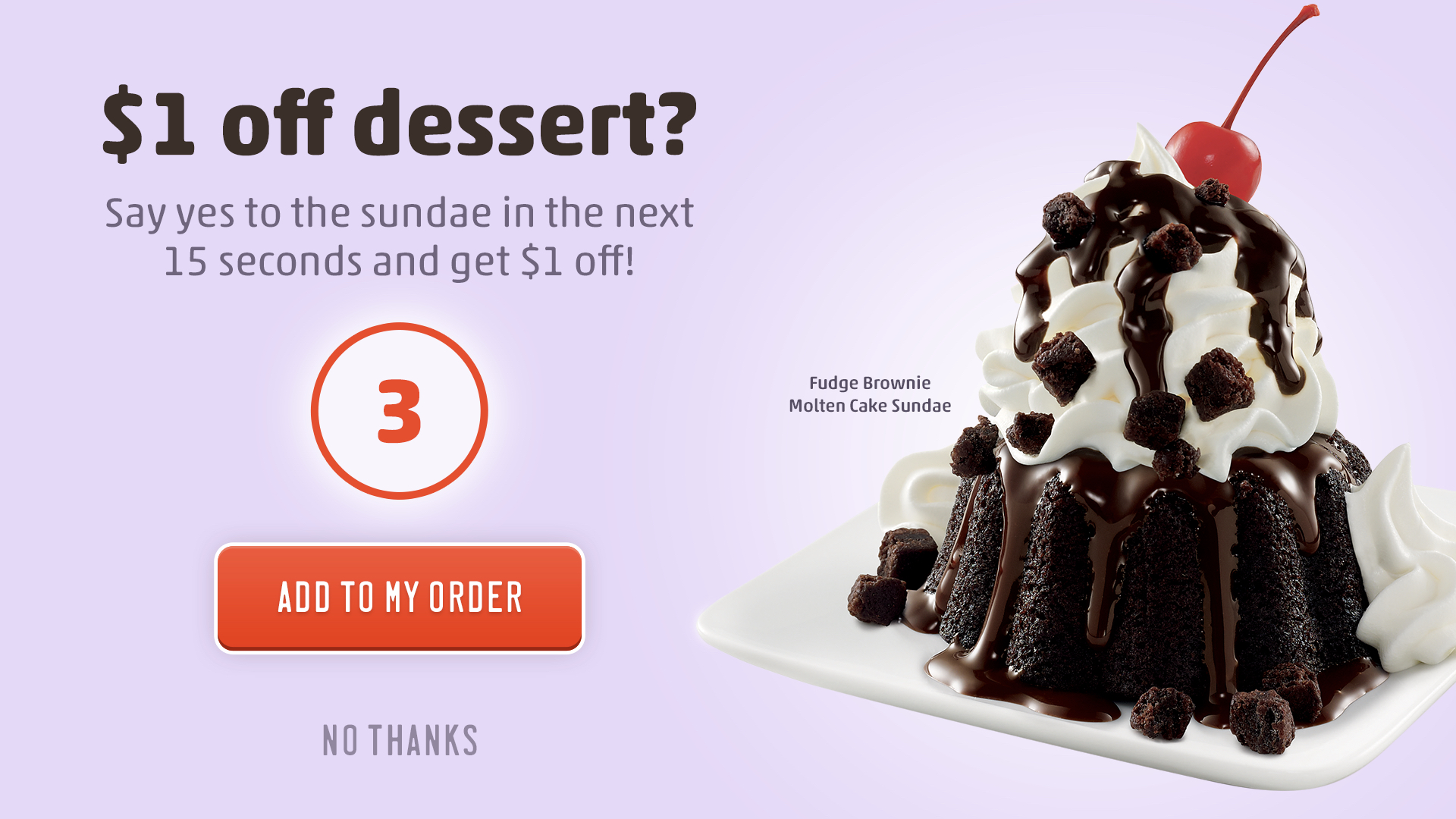
Back when I was leading innovation at Sonic Drive-In, we ran into a problem with our new digital ordering system called POPS—Point of Personalized Service. These touchscreen kiosks were mounted in the iconic drive-in stalls to replace the old menu boards. We’d delivered them to 300 stores. The plan was to scale across the remaining 3,300.
But no one was using them. No one was touching the touchscreen.
These screens had been designed like websites. Pages, buttons, navigation galore. It looked clean. Slick. Interactive. It also didn’t work, at least not in the Sonic stalls where they were strategically placed.
We found out, as we took over the project, that the team hadn’t tested the POPs stall experience in the actual context of a drive-in. No one thought to ask what it feels like to reach across your car to press a flat button on a glowing screen multiple times. The system had passed the marketing check. It did look good, but it failed the human one.
So, we did the obvious thing:
We brought real people to a real parking lot and asked them to order, in their cars, like they normally would.
And guess what?
People weren’t interacting with the screen because they literally couldn’t. The angle was weird. The reach was awkward. The seat belt rubbed or restricted movement. Those in trucks had a hard time reaching the screens at all, and those in compact cars had difficulty reaching the top buttons. Those in SUVs, though, were just right.
So when we presented this to the executive team, the same folks who greenlit the design, we got creative.
We had them sit at a table, extend their left arms, point their index fingers, and mime the order flow with us. Every time we mentioned a button or screen, they had to move their arm like they were reaching for the kiosk to touch a button on the screen.
By the time they added cherry to their Diet Coke, their arms were shaking.
They got it.
The insight?
POPS would never be the right place for full ordering. Phones were better. Already in the user’s hand and already integrated into their life. The kiosk could still play a role, but it needed to be quick, supportive, and non-essential (we landed on upsells and loyalty).
That day, we didn’t attack the current designs. We invited discovery. We introduced levity. We let them feel what the customer felt.
Shaky arms. Sore shoulders. Lightbulb moment.
Order Ahead shifted from the kiosk to the phone and stayed there.
That’s what I mean by People First.
Products should earn their place in people’s lives by making those lives better.
Not just faster. Not just stickier.
Better.